
Responsive Ads are high performing, dynamic, interactive ads, developed exclusively by Bucksense. The Bucksense Creative Suite enables advertisers to easily create and serve these ads directly from the Bucksense console.
Responsive ad formats allow users to take multiple paths, without ever leaving the ad unit. For example, users can:
- decide when they want to see your ads
- explore different topics
- schedule appointments and follow ups
Because these functionalities happen within the ad unit, flow breaking redirects are eliminated and there is a more streamlined flow to lead generation.
By combining these in-ad user experiences with Bucksenses programmatic optimization algorithm, advertisers get the most advanced audience insights and can discover detailed user paths to conversion.
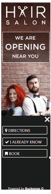
See here a gallery containing samples of how Responsive Ads are displayed.
Advantages of using Responsive Ads:
- users can take several different actions within the ad unit
- ads are fully customizable to suit your specific business goals
- quick and easy to upload and edit
- provide greater audience insights so that audiences can be retargeted, improving campaign performance and cost efficiency
- higher click-through rate (up to 2.5 times higher)
- enhances your brand by letting users explore different topics
How to create Responsive Ads in Bucksense console
Responsive Ads can be created by taking the following steps:
- Select Responsive Ads from the Creatives Tab
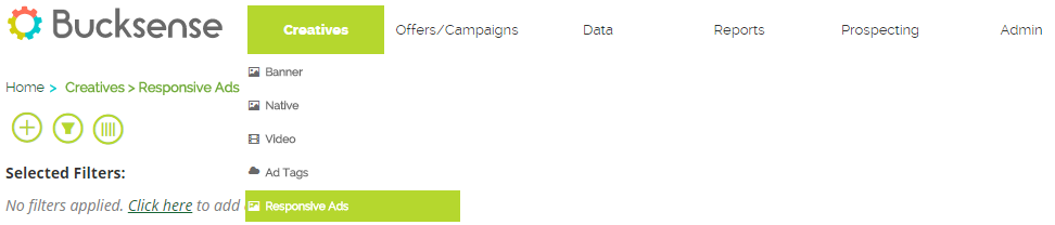
- Click
 to add a new responsive ad
 - Enter the following information:
– select the advertiser (must be associated to the offer/campaign you want to run).
– add a language from the drop down menu (the selected language will be the targeted language for the campaign).
– enter a name for your creative
– enter a landing URL (this is the URL where your clicks will go). Please note that this URL will replace the landing URL you set at the offer level)
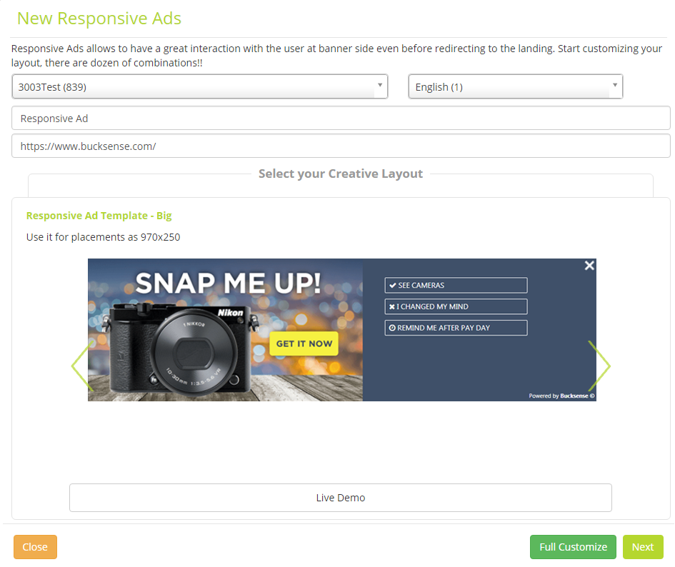
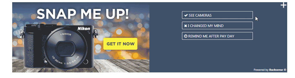
- Choose a creative template from the following options:Responsive Ad Template – Big (for 970×250 placements)
Responsive Ad Template – Medium (for 300×250 placements)

Responsive Ad Template – Small (for 320×50 placements)
Responsive Ad Template – Vertical (for 160×600 placements)
Click on Live demo to see a preview of how the ad template looks. Click on the Next button to create the ad.
Alternatively, if you want to fully customize the ad layout, click on the Full Customize button (recommended for advanced users). - Select ‘Click here to add your creative’

- Add a banner that is a similar size to your selected template. You can choose a banner that is already uploaded to the Bucksense console or can upload a new one by clicking on the Select file button. Click on the Close button to complete.
You can add several images to run ads with the same layout, but different graphics.
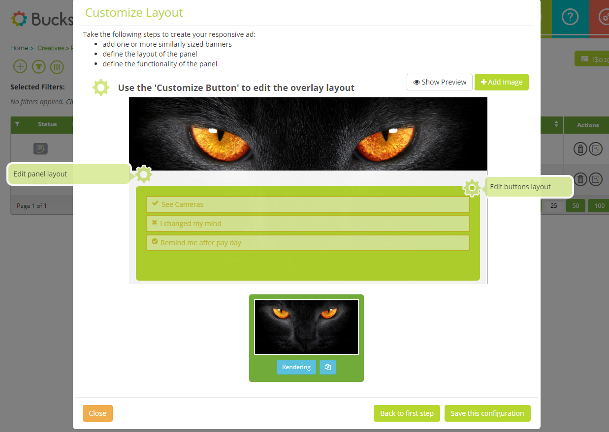
- You can now begin customizing the layout of the panel

Edit panel layout
To define the structure of your ad, such as position, colors, opacity etc., click on the Edit panel layout button. You can preview how the ads look at any time, by clicking on the close button in the panel style section and selecting the Show Preview button in the customize layout section.
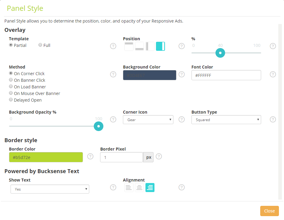 Overlay
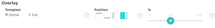
Template: Define whether the template should partially cover the image (Partial) or fully (Full) cover it.
If you choose partial, you must also choose the Position where you want the panel to appear (on top, on the left, on the right, at the bottom) and define the % of overwrapping on the panel.
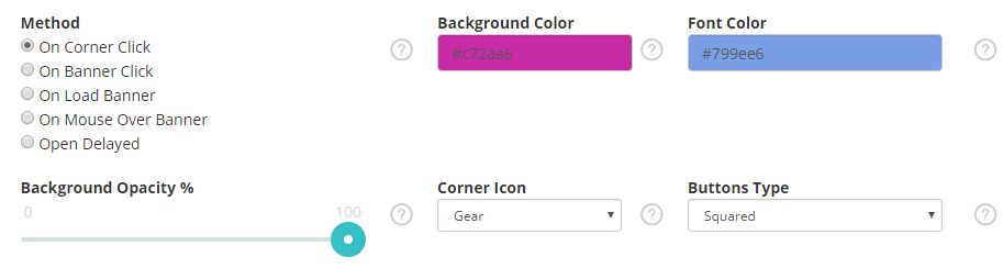
Method: Select how the panel should be shown on the image from the following options:
- On Corner Click: the panel will appear by clicking on the corner of the banner
- On Banner Click: the panel will appear by clicking anywhere on the banner
- On Load Banner: the panel will appear inside the banner without the need for the user to take any action
- On Mouse Over Banner: the panel will appear every time the cursor is positioned on the banner
- Delayed Open: the panel will automatically appear, with a slight delay, without the need for the user to take any action
Background Color: Choose the background color of the panel by entering the color code in the field, or by simply clicking on the color tone from the palette.
Font Color: Choose the font color of the panel header and footer texts by entering the color code in the field, or selecting from the color palette.
Background Opacity %: set the % opacity of the panel to stand out from the background
Corner Icon: if you have selected the On Corner Click method, you also need to choose the Icon style to show to the users (Plus or Gear)
Button Type: Buttons can be styled as links, rounded or squared
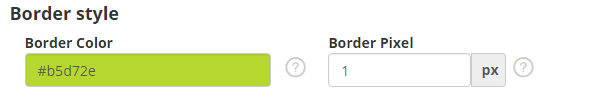
Border style
Border Color: define the panels border color
Border Pixel: set the width of the border (pixel)
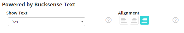
Powered by Bucksense Text
Show text: Select whether or not you want to show the ‘Powered by Bucksense’ logo in your ad
Alignement: If you choose to show the Bucksense logo, select the position of the logo.
Edit button layout
Click on Edit button layout to define the button texts, icons and functionalities.
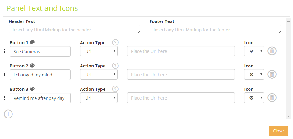 Header Text: Insert text to be shown on the panel header
Footer Text: Insert text to be shown on the panel footer
To edit the button layout, click  and choose your prefered style.

Set the Button, Text and Icon alignment.

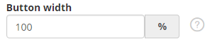
Define the percentage for the Button width.
Set the Text Color (the color of the text to show in the button), the Background Color and the Border Color.

Define how the text (Text Color Hover), background (Background Color Hover) and border (Border Color Hover) colors change when the mouse hovers over them.

Define the Font Family, Font Size and Icon Font Size: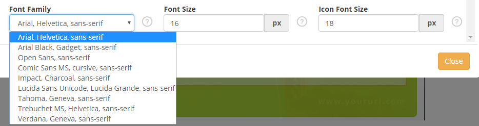
Click Close to return to the Edit Buttons Layout menu.
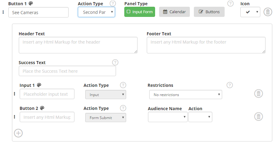
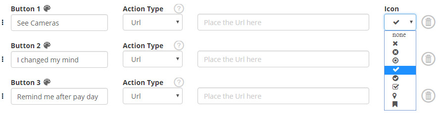
Button(s): Enter the text that will appear on the button (eg. See Cameras).
Action Type: Set the functionality of the button(s)
URL: the user is redirected to a URL. If you choose this option, you must also add a valid url

- Second Panel: by choosing this option, a second panel will appear when the user clicks on the button.
For your second panel you can show an Input Form, Calendar or Button(s)
- Audience: this option allows you to add the users who clicked to a specific Audience.
To do this, you must have previously created an audience (see here for how to create an audience). The previously created audience can be selected from the Audience Name drop down menu.
In the Action drop down menu, select whether the users must be added to (Add), removed from (Remove) to the audience, or, if you want to add users to an audience by specifying a keyword (Add Product) to be easily identified in the Audience list (for example the name of a specific product).

- App: Redirect users to a specific social page (Facebook, Twitter or Google Plus).

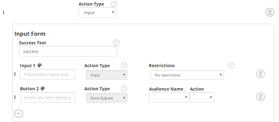
- Input: Choose this option if you want submit an Input Form to the user.
Enter a Success Text, an Input text and define any Input field Restrictions (Phone, Url, Email etc).
Icon: select the button icon
Click on the Close button and you will return on the main Responsive Ads menu.
And thats it!
Click on the Save this configuration button and choose if you want send the ad to the audit team or save it for later.
You can check how the ad looks in the browser by clicking on Rendering button below the layout image.
Alternatively click on  to copy the sample url and paste it in a new browser window.
See here how to create Responsive ads campaigns