Audience Reports and Charts
Once you have set up your app/site audiences (see here), you can access audience reports and charts to view your audience composition data.
Audience Reports
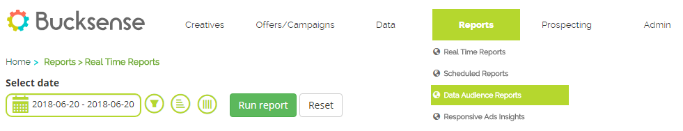
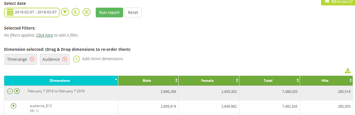
To access audience reports, simply click on the Reports tab and select ‘Data Audience Reports’.
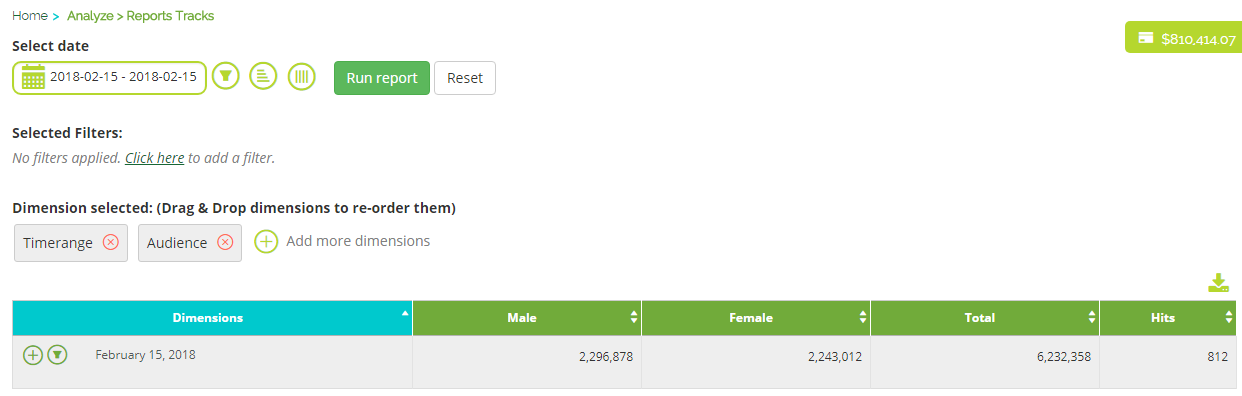
Your report will have the Audience dimension selected by default. This will allow you to check the data for each of your audiences.
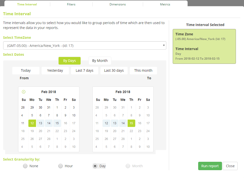
Click Select date to define a date range and the time zone for your data. Under Select Granularity, you can choose how campaign data is displayed: grouped by time interval, by hour, by day or by month.
The report will show you quantifiable data in different columns:
- Hits: the number of users added to your audience in the selected time range
- Total: the total number of users that populate your audience
- Male: the number of male users in your audience
- Female: the number of female users in your audience
Audience Charts
Audience Charts can be accessed by taking the following steps:
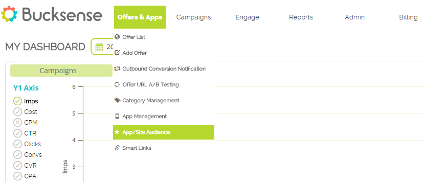
- Click on the Offer & Apps tab and select App/Site Audience.
- A list of the audiences you have created will appear.
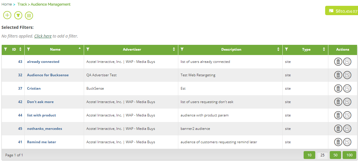
- In the Actions column, click on the charts icon
 for the audience you want to see.
 - Click on Select the interval period to choose the period of time you want to view.
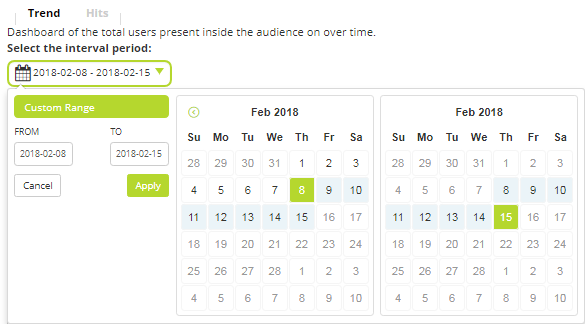
- The Trend section (by default) provides you with useful charts which show you:
– the total number of audience users for the selected time period (Unique users)
– the number of daily users that have been added to your audience within the selected time
period (Hits)
– the number of male users within your audience for each day of the selected period (Unique Male users)
– the number of female users within your audience for each day of the selected period (Unique Female users)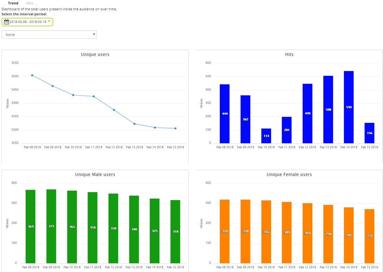
- To see audience charts that show the Country and Device OS distribution, just select them from the drop down

Country: shows you the unique users, hits, unique males and unique females, split by country.
By moving the cursor over the data columns, you can see the data in detail.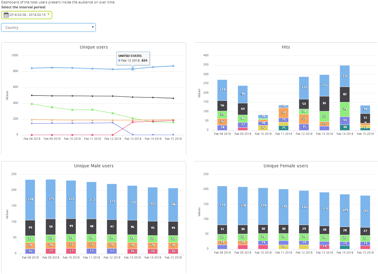
By selecting Device OS you’ll get the same 4 charts split by device operating system.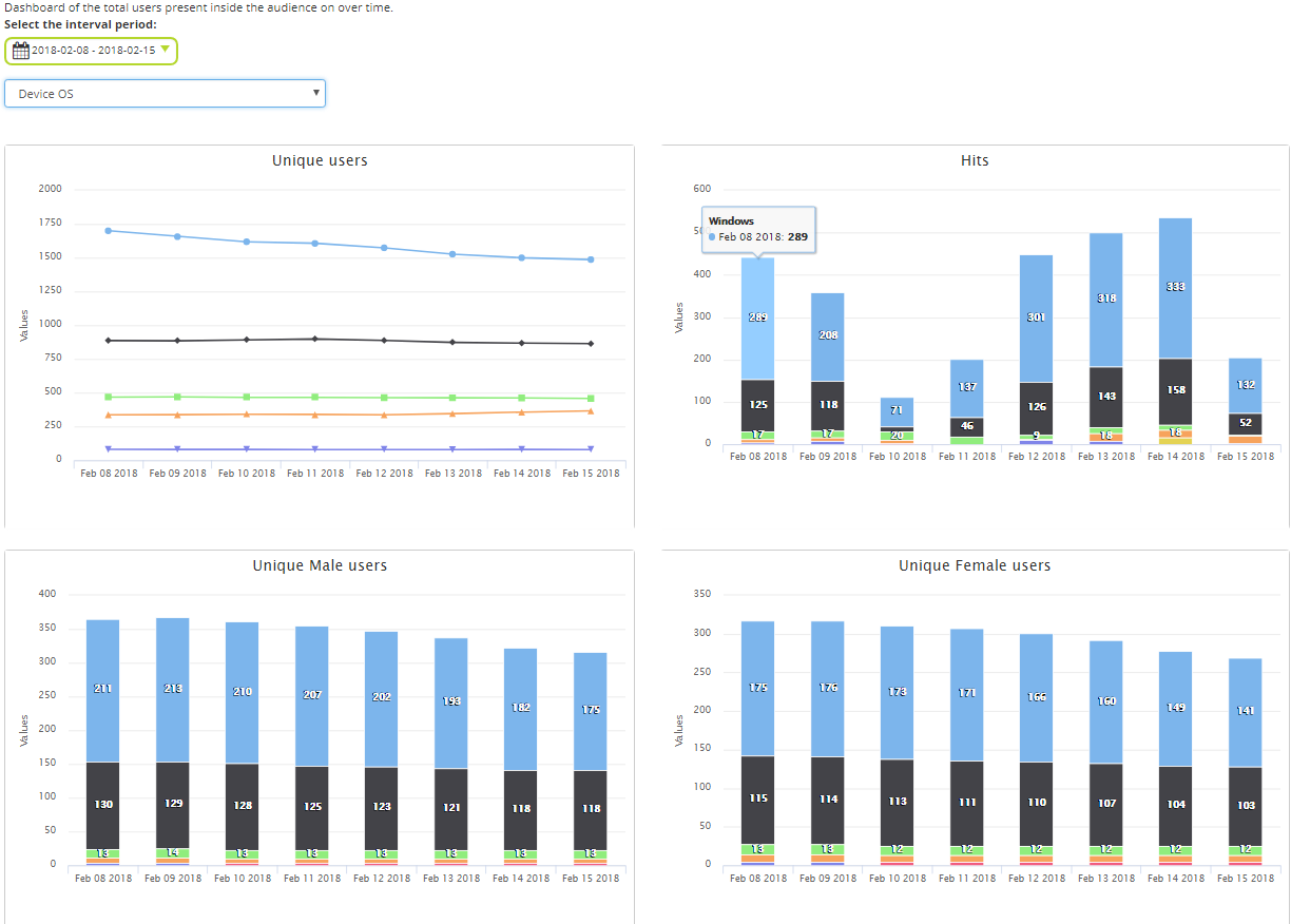
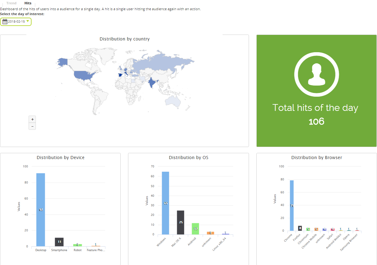
- The Hits section shows the new users added to an audience in a single day. You can see:
– Distribution by country into the planisphere (by moving the cursor over a country you’ll get the data for that country)
– Total hits of the day
– Charts related to the daily hits distributed by Device, OS and Browser